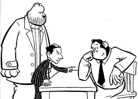
The picture below introduces the villains of the piece. No more Simian artwork to scan now.

Danny asked earlier where I'm up to with Simian so here's the update. The new final draft is all complete, it's shorter and tighter than the previous one but other than that there's nothing new about it, I haven't added any scenes or characters or taken any out, this was pretty tricky in places but it's always rewarding, hopefully it now reads smoother and is better paced.
Artwise I want to do another spot illo (all the ones shown are from chapter 1 BTW, apart from Simian jumping from his office, that's the start of Chapter 2 but I really wanted to draw it!) and a mock up of the cover. Don't know if it'll seem presumptuous to do a cover, it's just meant to be enticing. At the moment I haven't got a clue what to do for the cover, so I might end up not bothering including it with the manuscript.
And that's it.

3 comments:
glad you got your scanning sorted out, the artwork is looking great!
sounds like it's really starting to come together now, great stuff.
Augustus is looking great!
nice work
Post a Comment