Showing posts with label hero-z. Show all posts

Tuesday, April 01, 2008

Drawing and book stuff


Got word back about Hero-Z, and it's good news. It's great news actually, with two very big Brother Lee Love style thumbs up! Yay me! I take back all my panicked doubt and vow not to do that again. Until the next time:)
Still waiting for news about my slightly earlier secret project so you'll have to wait abit longer to see anything from that - unless you asked me and I sent you a sneak peak!
In the meantime I've started a new project, it's fairly brief and I'll probably post a few images over the next few days, so keep an eye out of you're interested.
A few posts ago I mentioned I was about to start reading 'Bust' by Bruen and Starr, well, it was fun, nothing amazing, brisk enjoyable read. Not quite 'hard' crime though, and as it's published by a company called Hard Case Crime it's fair to expect that. It was harder and less farcical than Carl Hiaasen though, and followed the same principle of low life character's greed and stupidity creating trouble.
After that I moved on to a book called 'Crimson Orgy' by Austin Williams which was also a lot of fun. Set during the making of an early (just after 'Blood Feast' in fact), and lost, exploitation horror movie called, you guessed it, 'Crimson Orgy'. The making of the movie proves to be difficult, but more than the sense of strange and impending doom, I enjoyed what seemed to be a genuine feeling of a small band of wannabes, not bothereds and troubled folk united and torn apart in their quest to make a film on the cheap. The prose is simple and direct without being clunky and the characters are nicely defined. I discovered this book, a fair few others through the wonderful Groovy Age of Horror blog, if you haven't visited it then give it a look.
After finishing 'Crimson Orgy' it seemed like the perfect time to pick a book of the shelf that had been sat patiently waiting for for quite a while. I'm only about a quarter of the way through 'Flicker' (it is over 600 pages though) but I'm enjoying it immensely. It's about fabled, and fictional, director Max Castle who started out working on The Cabinet of Dr Caligari and progressed to classic gothic horror of his own and then got eaten up by Hollywood producing B movies after suffering disgrace at the hands of those who didn't understand his work. His reputation initially seems to be nonexistent and his films lost, some never even released, but after a few quirks of fate one his films is discovered leading to a reappraisal. That's where I'm up to at the moment, and the back cover promises a lot more oddness.
Very nice dense, but easy to follow, prose and some serious research, and obvious love, raise Flicker much higher than the cheap tagline 'Sunset Boulevard meets the Da Vinci Code'. The mere mention of the Da Vinci Code's enough to put me off, but it does seem that it's mentioned only in an atempt to entice the millions who bothered with the poorly written item - although content wise there is a parallel of a secret religious order and a conspiracy, but still, cheap marketing is cheap marketing. Rosak has been involved writing about counterculture before, and this history obviously comes in handy for the time and setting of Flicker.
Can't remember when I first heard about Flicker, I know it was before I saw the intitially similar John Carpenter short 'Cigarette Burn' (not his best work, but well worth seeing), but what did make me want to read it was Murray Ewing's review here. Murray also writes about Cigarette Burns here, and adds to the 'fictional film with a dark past' genre with his review of Ramsey Campbell's 'The Grin of the Dark' here. I'm sure I've got a copy of Campbell's other entry into this genre, 'Ancient Images', kicking around somewhere too. 2000ad had a stab at the genre recently with 'Chiaroscuro' by Si Spurrier and 'Smudge' (a pen name for Cam Smith judging by the artwork), and although it was fun and reasonably enjoyable, it seemed a little uninspired to me. Also worth a mention is The Faceless: A Terry Sharpe Story by Robert Tinnell and Adrian Salmon. It doesn't really fall into the genre, but it does involve fictional films of a very Hammer-esque nature, and is damn good with some wonderful artwork - and that's all the excuse I need to mention it:)
Enough of this ramble, for those who haven't heard already, Garen (yes, related to Murray) Ewing's superb strip 'Rainbow Orchid' has been picked up by large UK kid's publisher Egmont, as they also publish Tintin over here I can't think of a more perfect fit for Garen's perfect book. Garen has pursued his own vision to produce a story of outstanding quality, which is laudable enough, that he'll now be able to reach an even bigger audience is richly deserved , there's more info on this excellent news here.

Sunday, March 23, 2008

Hero-Z, one last time. For now.


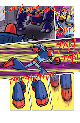
Here's pages seven and eleven from Hero-Z. Call me crazy, but I'm guessing the publishers would rather I didn't show the entire strip before the book comes out, so I'll not post anymore for now.
The sound effects on page seven should be a good indication of how far my tongue is in my cheek with this strip. After my initial idea grew a little larger (I originally saw this as about 4 pages, it's ended up as 13) my approach to the artwork had to change, the conceit I came up with was to attempt to draw something fairly retro looking, I looked at mainly 60s/70s manga and a few other things. I got a bit nervous about whether this was working part way through, and looking at it I can see it's not what I originally saw in my head, but I think it works anyway.

Saturday, March 22, 2008

Hero-Z again


Here's the 2nd Hero-Z page, with more 'influences' possibly becoming apparent.
As Peter asked, here's how I did it.
1. Drawn on paper the old fashioned way, then scanned.
2. Turned the linework into a 'channel' by copying it into channels, then loading the selection onto a blank page in layer. I'll post some links at the bottom with more detail about stuff like this.
3. Opening a new layer underneath the 'lines' I filled the page a mid-grey then went over it with a dark grey for shadows and a lighter grey for highlights. This meant I could see the whole page finished without having to worry about the colours just yet.
4. Selecting the areas I was interested in (let's say all of Z's forearms, bottom legs, belt and chest) I went into 'image', selected 'adjustments' 'photofilter' and turned the grey into a navy-ish blue. Then I repeated this for all the various elements in all their various colours.
This step was not as straightforward as it sounds, I hadn't tried this technique before and realised I shouldn't have been so arbitrary about my choice of grey shades, also selecting the correct colours in photofilter wasn't always giving me the exact colours I was after so I tried to correct them adjusting the brightness/hue/etc in the 'image/adjustment' selection. This was closer but not quite, so decided to select my colours from the swatches and filled them in with the paintbucket. Starting with grey then adjusting to colour is helpful, but I clearly need practice, after a few tries at it I decided go straight from selecting areas to filling the greys with colours selected from the swatches.
5. With all the colouring done (using a limited palette I trial and errored as I went along (I knew it's be blue and purple with the odd chunk of red and yellow, but I still had to get the right shades) on the characters I copied various elements into new layers and laid a filter (usually motion or gausian blur) over them. I did these in separate layers because I want different parts filter differently - for example, on page 1 I knew I wanted a bad guy robot head in the foreground but I drew it after I'd done most of the colouring, I scanned it in separately, put it on a different layer, coloured it, copied the colour into another layer, blurred it, then blurred, more subtly, the original layer of line and colour art and merged them together to get the effect I had in my head. The other aspect I did separately was backgrounds, 'painting them in photoshop and then blurring to get the right look. I was a bit worried about this aspect, my backgrounds can either be a bit weak or betray their reference too much, for the look appropriate to this story both would be a problem, in the end I'm pretty happy with the way that worked out, you'll have to wait to the end to decide if they're appropriate though.
7. One final layer for the sound FX, again drawn on paper, scanned and then filled in yellow, selected, contract selection then fill the smaller area red.
6. That's it. Normally I like to add some interesting effects, half tones can give an nice graphic look, but there's a good reason I couldn't do that here, I'm just not going to tell you what it was.
Looking over what I've written I realise how laborious this sounds, that's partly because of the trial and error aspect, and partly my nerves making me probably go into more layers than necessary. But it didn't really take as long as all this blather might make it seem, and messing around is part of the fun for me. I'm not really much of a colourist, but I think I've found the real trick, it's not layers, it's not effects, it's not even shading, it's about picking a palette, a fairly limited one works best, and sticking to it.
There's quite a few tutorials floating around by far better folk then me, here's some I've found helpful - D'Israeli(go to the 'education' bit), INJ, Mike Laughead, Dean Trippe and Mike Maihack. There's been a few other places I found stuff, but these are the ones that have been most helpful in a 'hands on' way, the others have just given me other ways to think about how to draw/colour. Hope you find this, and more likely, them, helpful.

Tuesday, March 18, 2008

Hero-Z!


Here's the finished first page of the strip I'm working on at the moment. It's been tough, but hopefully it'll be worth it. I've still not finished the full story, but plan to have it all done by the weekend, there's only one page to do from scratch, so it should be okay.

Tuesday, March 11, 2008

Hello everybody


Hello to anyone coming here from Neil Vokes link on Jinxworld, hope you like what you see. To save you wading through my waffle you can just click here for all my artwork posts, or go here to see my comicspace gallery.
Here's a work in progress, it's going to be in colour, but I'm nicking Ian Culbard's (sorry INJ, hope you don't mind!) technique of toning first, then adding colour after. It's a bit light on backgrounds, but I h
ope to add some in the colour version before the deadline runs out. The character designs probably should be explained a little..... it's a little tongue in cheek:)

Wednesday, January 23, 2008

Some silly pictures


Been meaning to post something for a while now, but I haven't done anything worth posting. However, after a much deserved prompting here's some scribbles.These are for vol. 3 of Best New Manga. First up is some thumbnails, the blank bits are where I have no idea what to draw, on page 2 it's because I've not designed a big tanky robot, and that's much the same for page 4. I'm trying to be 'proper' here doing everything in stages, I do usually draw thumbs, but they're never as complete, organised or as legible as these.... assuming you can see what the hell is going on!
Second is the rough pages 1 & 2. Spending a bit more time on the thumbnails is paying off, as at this stage I've usually redrawn each panel a dozen times and the results look like a mass of scribble (really, I often manage to tear though the paper) These pages where penciled in very rough shapes and a tiny amount of detail then I went over them with a grey marker. Next I'll go over the grey line with black pen adding a little more detail (lets face it, I'm not really into lots of detail) and making things clearer. After that I'll enlarge the pages (these are drawn same size as printed), tape them to the window in my front room slap a sheet of bristol board on top and copy the final pencils onto it altering and tightening as I go. My pencils are so scribbly and messy even to my eye that I never pencil directly onto nice paper.
Lastly is the design for the main character, and you just might notice a retro look about him. I don't really know much about this sort of stuff, but I knew I liked the look of the older stuff better than the high tech fancy stuff.