I decided to go back and group all my fingerpaintings in chronological order. I thought it might be interesting to see the development and progression.... at least, it's interesting to me!
I think it's fairly obvious on the first 5 halloween themed pics that I was thinking in terms of starting with one big shape and adding simple detail. At this point fingerpainting was just throwaway fun.
Dredd broke with the style of previous pics and propted my Dennis the Menace, which, if I may be so bold, I'm really pleased with. In fact, with Dennis I though, I'd be quite happy with a Dennis comic fingerpainted like this.
I didn't originally post the Hulk pic as I thought it was a bit clumsy, but as I've done more fingerpaintings my idea of 'good' has changed somewhat. Basically, if I had fun, then the picture is 'good'.
With Darth I'm trying to go back to the single dominant shape and simple detail.
My daughter had been playing a lot of Sonic, no other reason for that pic.
There's always some Pixar on in this house, and I'm pretty happy if it's Monsters Inc. The last 2 pics here look like I was starting to break free of the simple approach, if only by having more than one character on a pic.
So, even after just 12 pics I think there's a progression of sorts. And it doesn't stop there!.......
Showing posts with label zombie. Show all posts
Showing posts with label zombie. Show all posts
Sunday, October 28, 2012
Friday, October 12, 2012
More Fingerpainting
Here's all the fingerpaintings I did on Finngr yesterday, 3 times as many as I posted before.
I had a lot of fun doing these, the limited palette and lack of erase and undo really helps focus your mind and frees you from caring. Not all of them are successful, but I learned a lot doing them. I have a few favourites from them, but they might not be the same as yours, so I'm keeping my mouth shut!
I had a lot of fun doing these, the limited palette and lack of erase and undo really helps focus your mind and frees you from caring. Not all of them are successful, but I learned a lot doing them. I have a few favourites from them, but they might not be the same as yours, so I'm keeping my mouth shut!
Labels:
Batman,
darth vader,
death,
dennis the menace,
Dr Who,
drawing,
fingerpainting,
finngr,
James Bond,
judge dredd,
Monsters Inc,
Mr X,
olivia,
Robocop,
sonic the hedgehog,
toy story,
vampire,
werewolf,
witch,
zombie
Thursday, October 11, 2012
Fingerpaintings
Quick drawings done on a fingerpainting app called Finngr, recommended by David Hailwood. It's got a minimal palette and no erase or undo. Nice and simple.
These are mostly halloween themed, but Dennis the Menace sneaked in too.
These are mostly halloween themed, but Dennis the Menace sneaked in too.
Labels:
dennis the menace,
drawing,
fingerpainting,
finngr,
halloween,
ipad,
vampire,
werewolf,
witch,
zombie
Monday, September 27, 2010
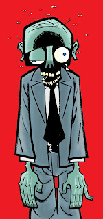
The Return of Hugo
 Hugo the zombie, last seen in Zombie of the Great Unwashed, returns in 'Bits'. Sadly, he doesn't return on this page, and I can't really show the other pages because they're a bit spoiler-y, so you'll have to wait:) Or maybe you could just buy a copy of the comic it'll appear in when fine writer Jason Cobley puts it out.
Friday, November 23, 2007
Moving Target artwork

 Not much artwork posted lately, but I have been busy. These are the front and back covers for Jason Cobley's 'Moving Target'. Jason asked for something quirky figuring I'm good at that. Well, I wasn't! After reading the book (very good indeed!) I couldn't come up with an image I felt summed it up. In the end I went for a bit of an obvious choice, but when Jason saw it he was so please he opted for leaving off the title and his name! I'm especially pleased about this as I felt it could've been stronger (the original rough had less space between faces and I mistakenly believed this was one of the things to correct in the final version), so the vote of confidence went down well.
When I saw the back cover using my original design featuring 'Hugo' from Jason's adaptation of the comic-strip we worked on I thought it could be improved and more could be made of the title and author text to make up for it not going on the cover. A quick fiddle with the layout and colours and you can now see the end result. If you'd like to read a sample of the book (and then buy it, you know you want to!) here's the link. Due to circumstances beyond his control Jason's had to take down his blog, so comment here to convince him that his idea for a 'Zombie of the Great Unwashed' sequel must be written!
Sadly my busy couple of weeks has meant I've skipped the last two Illustration Fridays. This is doubly annoying as I had an idea for 'Scale' that I'd wanted to use for the last four months. I tried to knock it out quickly but just wasn't happy with the results at all. I'll still draw it, but in my own time I think.
I've got a couple of scribbles on the drawing board that I plan to turn into pictures soon, in the meantime I've got a script to draw. It's a tight deadline, but that's my own fault, and I reckon and can still make it anyway. Gulp!
Thursday, November 08, 2007
Zombie of the Great Unwashed revisted
Sunday, July 01, 2007
Redux
Just finished messing around with 'Zombie of the Great Unwashed', it's now got a grey tone and some general tidying up. If you want to see the new version go here I'm going to work on a toned version of 'Bad Advice', my contribution to 'Best New Manga', I might even redo some of the bit's that don't work, it's a bit of a Lucas, but seeing as I was turned away from doing something for the 2nd volume I figure it probably does need improving. No badly CGed characters will be added though:)
Friday, February 02, 2007
Zombie of the Great Unwashed page 5
 Bit of background here for a change, and it helps! There was originally supposed to be an exterior establishing shot of the burger place but Jason suggested it might not be necessary so I decided against it. Not sure if Jason was after Derek fancying the girl serving him but the dialogue seemed to suggest it to me so that's why he's grinning (not suffering from mumps!) and rubbing the back of his head in panel 2..... oh I am the master of body language! Went a bit over the top with Hugo's zombie lurch on p3, but dammit I like him!
Panels 4 and 5 was originally one panel but I thought it'd be nice to slow the action of finger eating down. Not intended but the graphicy look of the last panel makes it feel like a nice full stop.... I think. Attempting to make the finger look exclamation mark like was intention, but as usual I'm not sure if that comes across.
And that's it, as whiney as I am about my work it's been fun and writing about it like this helps me see where I need to improve (background, backgrounds backgrounds!), hope you all enjoy the story and I'll let you know when the finished book comes out.
Zombie of the Great Unwashed page 4

That's some seriously stylised trees (perhaps they inspired Eileen's hair), but I like them and think they work. There's no perspective to speak of working here but after sketching an early version of this using proper perspective I just didn't like it, perhaps because of the odd looking trees. More panel repetition and straigtforward composition, but I like it here because of the back of the bench unifying it a little - little confession, these panel had to be reversed and redrawn cos I got Hugo and Derek the wrong way round, oops, that's like drawing an extra finger on someone's hand (which I've also done once or twice). Jason pointed out that it might not be immediately apparent that the note Derek is holding was previously stuck to Hugo's face, I have asked AccentUk if I can redo it, but it's not looking likely.
Zombie of the Great Unwashed page 3

This page went through a complete layout change, mainly based around how to do the first panel. The script asked for the setting to be a modern bank in an old fashioned building and I had originally planned to have the panel run the width of the page, but as I'd already worked out the last panel and liked it as it was I realised panels 2 and 3 would be cramped. Also the old fashioned banks are all about ceilings, so I did a rejig and came up with this page. My slow thinking on this meant it was the last page I drew and as such it's rushed - the ceiling is the only thing that says 'bank' in panel 1 (ever tried to take a photo of a bank interior? Frowned upon.) The last panel highlights a bit of mistake I always make, I get grabbed by an idea for only part of image and then have to fit the rest of artwork around it. Still, that's some nice zombie biting action:)
Zombie of the Great Unwashed page 2

A bit more background on this page and a work on Eileen's outfit wouldn't have gone amiss. The challenge of this page, and the first 3 to some degree, is that there's 3 people close together reacting to each other, compositionally that's tough (for me, anyway) to do and keep things interesting. Fortunately there was a clue in Jason's script that asked for a panel to be repeated so I went for more repetition. I think the column of panels on the right works better than the left, Hugo slumping is a nice touch (Jason's touch not mine) and I'm pleased with the slight zoom to the newspaper with Hugo and Derek poking over the top. Eileen's hand in p3 is supposed to give the impression that she's barely looked at the form, not a bad idea, but I'm not so sure I pulled it off - although Jason emailed me and did meantion he like the hands in the story, so maybe I did! As scripted panels 5 and 6 were actually one panel, I split them as I liked the symmetry of layout and it made it easier to show everyone's faces and the newspaper headline.
Thursday, February 01, 2007
Zombie of the Great Unwashed page 1
 As I've not heard that I shouldn't post this I've decided to go put up the 1st page from Zombie of the Great Unwashed with a bit of added commentary. cFirst panel and the face should've been bigger to make more impact, but there was a fair bit to put in the rest of the panels and quite a bit of dialogue (Jason likes dialogue and I like Jason's dialogue so even though he was fine with changes I tried to avoid them) as well as the title. I thought about having dramatic lighting or a black background to make it jump out, and play against the everyday settings, but in the end went with sparse background (intentional for once!) and my usual heavy inking for Hugo. The large word balloon's had a missing word artlessly shoved in driving home the need to sort out an art package on my Mac. Lack of background in the next panel might not get the point across that this scene is in a Job Centre. Pulling back to show more of the setting would've helped but I think the main characters are small enough. The guy in the star t-shirt is from a comic I did waaaay back, sad to see him all washed up, but them's the breaks. Last tier's a bit crushed (particularly p4 with it's questionable foreshortening!), but I wanted p2 to run the width of the page, so it had to be. The last panel was originally meant to be the first panel of the next page but I got all 'meta-panelly'.
Tuesday, January 30, 2007
Zombie of the Great Unwashed page 2
I don't want to moan about my artwork on these posts, but I will say I find this page the least effective. A bit more in the way of backgrounds and a bit more work on Eileen's outfit wouldn't have gone amiss. The challenge of this page, and the first 3 to some degree, is that there's 3 people close together reacting to each other, compositionally that's tough (for me, anyway) to do and keep things interesting. Fortunately there was a clue in Jason's script that asked for a panel to be repeated so I went for more repetition. I think the column of panels on the right works better than the left, Hugo slumping is a nice touch (Jason's touch not mine) and I'm pleased with the slight zoom to the newspaper with Hugo and Derek poking over the top. Eileen's hand in p3 is supposed to give the impression that she's barely looked at the form, not a bad idea, but I'm not so sure I pulled it off. As scripted panels 5 and 6 were actually one panel, I split them as I liked the symetry of layout and it made it easier to show everyone's faces and the newspaper headline.
Back again
Been a while since the last update, I won't lie, it's been a tough couple of weeks. Work (the regular paid kind) has been not good for a variety of reasons, it's been odd.
Olivia's become more.... 'challenging' during the evenings, which is... 'fun'. It balances out really well though because she's also getting seriously interactive, responding to my Beaker impressions with smiles, laughter and some beautiful cooing that puts Gizmo to shame.
In the odd spare moment I managed to finish 'Zombie of the Great Unwashed', just last night, which feels like a major achievement in the circumstances. I'll post artwork up with some comments, a sort of 'commentary' kind of thing I've nicked from someone else.
Thursday, January 18, 2007
Progress
Eek, the zombie deadline looms ever closer like a, um, hungry zombie. Three pages are completely penciled, another two thirds penciled and one sort of over half way penciled but I'm unsure about the layout so want to mess a little. I've also started inking, but as I jump from panel to panel it's hard to say how much I've done. Anyway, the deadline's end of the month and I should manage that okay, in fact if I wasn't at work this weekend I might have done it by Sunday. It'll now be appearing in a more graphic novel-y format as AccentUK have had enough submissions to go that route. The next anthology will be robots and I had a nice idea for a story today so I'll try and contribute to that, early planning I know, but probably a smart move.
Not much else going on workwise, writing's ground to a halt as I struggle with plot and an overall lack of faith in the book industry. I put myself under a lot of pressure by dreaming how wonderful it would be to be published and paid to do something I love that frankly I lost track of the fact that I could care less about being published and would still try and make things up if I was paid or not. That and a growing dislike of the state of books makes me think I should put those dreams aside and just enjoy doing whatever I get round to doing.
Not much else going on workwise, writing's ground to a halt as I struggle with plot and an overall lack of faith in the book industry. I put myself under a lot of pressure by dreaming how wonderful it would be to be published and paid to do something I love that frankly I lost track of the fact that I could care less about being published and would still try and make things up if I was paid or not. That and a growing dislike of the state of books makes me think I should put those dreams aside and just enjoy doing whatever I get round to doing.
Thursday, January 04, 2007
Actual sneak peak
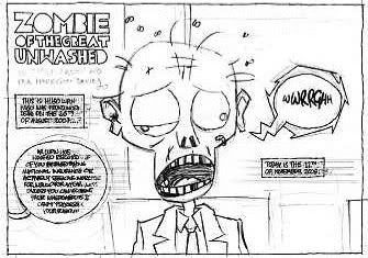
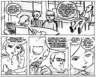
Here's the promised page of pencils (in 2 parts due to duff art package, hope they actually fit on the screen proberly this time!) for Zombie of the Great Unwashed. Still no further forward to deciding how to render panel 1 (I'll probably just do it with no black areas and then experiment on photocopies to see which one works best)
Might go over the scratchy borders with a thicker pen, I love scritchy line work which is probably a bit odd since I strive for quite smooth brush work.

Tuesday, January 02, 2007
Sneak preview of a sneak preview
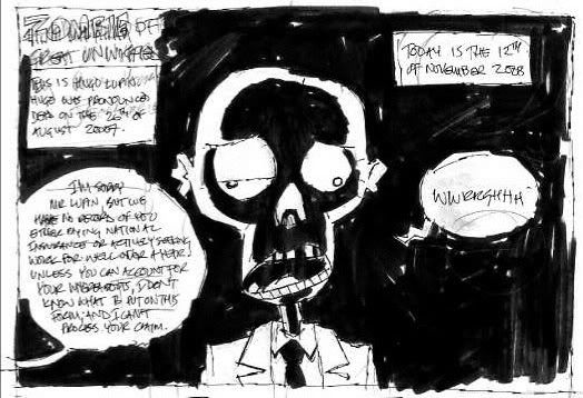
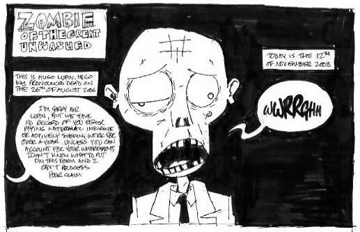
Finished pencils up soon, in the meantime here's the very first panel. Twice. First version is the initial (after the previous four) sketch, then there's my tighter version. I'm a bit stuck how to ink the final version because of these. See, I can't decide if the dramatic shadows on the face are too much. In the context of the light hearted story it might be a little OTT, but then I like the incongruity of it. On the other hand maybe just blacking out the (not very interesting in this panel) background will be enough....
What to do, what to do.
Thursday, November 23, 2006
For Mr Glazebrook

Man this one took longer than it should've! I fiddled about far too much with the placing of each zombie to try and give them a decent outline but still look like a big jumble of DEATH!
Obviously this scene doesn't quite appear in Return of the Living Dead, but I'm gonna call artistic license if that's ok.
Subscribe to:
Posts (Atom)


