
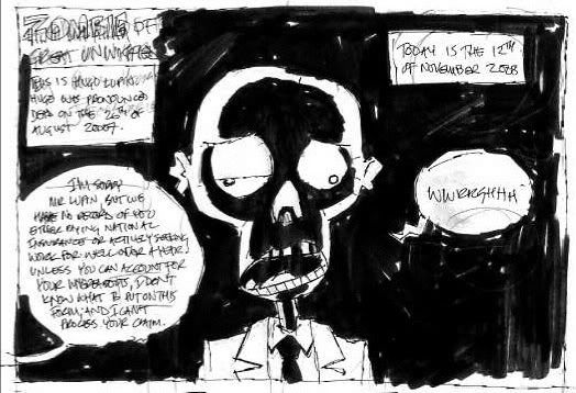
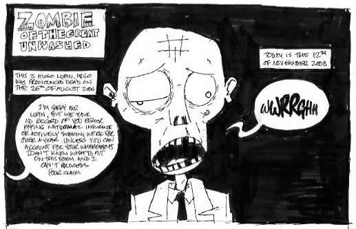
Finished pencils up soon, in the meantime here's the very first panel. Twice. First version is the initial (after the previous four) sketch, then there's my tighter version. I'm a bit stuck how to ink the final version because of these. See, I can't decide if the dramatic shadows on the face are too much. In the context of the light hearted story it might be a little OTT, but then I like the incongruity of it. On the other hand maybe just blacking out the (not very interesting in this panel) background will be enough....
What to do, what to do.
4 comments:
very nice
Personally I like the shadow free version, but whatever fits the story best. you might want to have a read of this if you haven't seen it yet as well. http://divalea.livejournal.com/408977.html
Thanks INJ. Cheers for the link Peter, interesting reading, should be helpful.
The reason I like the 'dramatic' panel is because the zombie is supposed to be a bit rubbish so I guess it makes it a bit more of a punchline to have him looking a little more menacing initially..... although I think my design of him is a little cute, still, Ulf K makes death look rather sweet, so why can't I make my zombie cute:)
I think they're as good as each other in different ways. And that's no help whatsoever... so I think you just have to choose!
Post a Comment