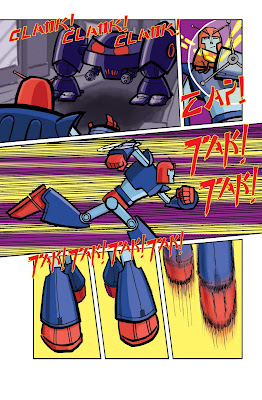
Here's the 2nd Hero-Z page, with more 'influences' possibly becoming apparent.
As Peter asked, here's how I did it.
1. Drawn on paper the old fashioned way, then scanned.
2. Turned the linework into a 'channel' by copying it into channels, then loading the selection onto a blank page in layer. I'll post some links at the bottom with more detail about stuff like this.
3. Opening a new layer underneath the 'lines' I filled the page a mid-grey then went over it with a dark grey for shadows and a lighter grey for highlights. This meant I could see the whole page finished without having to worry about the colours just yet.
4. Selecting the areas I was interested in (let's say all of Z's forearms, bottom legs, belt and chest) I went into 'image', selected 'adjustments' 'photofilter' and turned the grey into a navy-ish blue. Then I repeated this for all the various elements in all their various colours.
This step was not as straightforward as it sounds, I hadn't tried this technique before and realised I shouldn't have been so arbitrary about my choice of grey shades, also selecting the correct colours in photofilter wasn't always giving me the exact colours I was after so I tried to correct them adjusting the brightness/hue/etc in the 'image/adjustment' selection. This was closer but not quite, so decided to select my colours from the swatches and filled them in with the paintbucket. Starting with grey then adjusting to colour is helpful, but I clearly need practice, after a few tries at it I decided go straight from selecting areas to filling the greys with colours selected from the swatches.
5. With all the colouring done (using a limited palette I trial and errored as I went along (I knew it's be blue and purple with the odd chunk of red and yellow, but I still had to get the right shades) on the characters I copied various elements into new layers and laid a filter (usually motion or gausian blur) over them. I did these in separate layers because I want different parts filter differently - for example, on page 1 I knew I wanted a bad guy robot head in the foreground but I drew it after I'd done most of the colouring, I scanned it in separately, put it on a different layer, coloured it, copied the colour into another layer, blurred it, then blurred, more subtly, the original layer of line and colour art and merged them together to get the effect I had in my head. The other aspect I did separately was backgrounds, 'painting them in photoshop and then blurring to get the right look. I was a bit worried about this aspect, my backgrounds can either be a bit weak or betray their reference too much, for the look appropriate to this story both would be a problem, in the end I'm pretty happy with the way that worked out, you'll have to wait to the end to decide if they're appropriate though.
7. One final layer for the sound FX, again drawn on paper, scanned and then filled in yellow, selected, contract selection then fill the smaller area red.
6. That's it. Normally I like to add some interesting effects, half tones can give an nice graphic look, but there's a good reason I couldn't do that here, I'm just not going to tell you what it was.
Looking over what I've written I realise how laborious this sounds, that's partly because of the trial and error aspect, and partly my nerves making me probably go into more layers than necessary. But it didn't really take as long as all this blather might make it seem, and messing around is part of the fun for me. I'm not really much of a colourist, but I think I've found the real trick, it's not layers, it's not effects, it's not even shading, it's about picking a palette, a fairly limited one works best, and sticking to it.
There's quite a few tutorials floating around by far better folk then me, here's some I've found helpful - D'Israeli(go to the 'education' bit), INJ, Mike Laughead, Dean Trippe and Mike Maihack. There's been a few other places I found stuff, but these are the ones that have been most helpful in a 'hands on' way, the others have just given me other ways to think about how to draw/colour. Hope you find this, and more likely, them, helpful.

4 comments:
Very nicely explained and much appreciated. Lovely art as well and further proof that you're a bloody fine artist.
And yeah, you're right. You should make more of anything you do like "Rok" or "down the tubes" Sadly a big part of being a "creative" is self promotion. If you want to make a living at this stuff you need to work on that part more than anything. Your art and writing are already of a professional quality. Hero Z would certainly not look out of place in "The Beano", any of Panini's books or anywhere else in terms of professional quality.
Now hurry up and get famous so I can sell my original page from "Big Three" on Ebay for big bucks
No problem Peter, glad you liked it.
As far as self promotion goes, I have, belatedly, started sending stuff out, and plan to do more. Funny you should mention The Beano, I've been thinking I'd like to sort something out to send The Dandy.
What Big3 page do you have, don't even remember giving it away!
it was a rather stunning page with the villain crossing a checkered floor drawn beautifully in perspective.
Think I remember that one, was the villain that guy with fire for hair?
Nice that you still like it, I've not looked at any Big3 stuff in a looooong time:)
Post a Comment