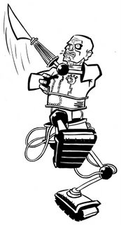
 Pedro Henry and Curt Viles' classic creation from 'Sounds' and later, with Steve Dillon/Mick Austin/Alan Davis, in 'Warrior'.
It's the 'Sounds' version that I liked best so that's the version I decided to draw, Steve Dillon's redesign was great but I just liked the quirky lo-fi charm.
This is the pic I decided to redo, there's not that much difference between the two versions, but enough to keep me happy!

11 comments:
nice. REALLY nice. love this one
Things are actually probably moving down, babywise, as I'm sure Rebecca's bladder knows.
Go buy some baby clothes!! Get a few little things around...it gets so real :-) With our son, I was afraid I was going to jinx us by getting stuff too soon, but then that was the hormones talking.
I love your work. You may feel like rubbish, but you're churning out some ace stuff! Sometimes inspiration save itself for the miserable. But you're not miserable, right?
Olivia's only just starting to move down, so Rebecca's not too bad at the moment.
Many clothes have been bought, we did leave it a while because of jinx worry, but gave in when confronted with cute clothes.
Miserable? Well, it is my default setting:)
Glad the artwork's being enjoyed (cheers INJ! Can I be cheeky and ask why you loved it? Only interested because I scrapped the other version), have to say I'm enjoying doing it. I do wonder if I should be doing something a bit more substantial, try and come up with something I can put into a portfolio or at least come up with a proposal for something. But for now it's enough to just have fun drawing and see if anything more comes to mind.
Lol@ miserable being your default setting. Mine used to be, now I'm just moody, 'my life is awesome, I hate everyone...' go figure.
We cannot expect happiness, it more than we deserve
Strong imagery utilizes negative space (ie: work as a silhouette). This one doesn't (not that that's a bad thing) and yet still manages to be a strong image. For the most part because the forshortening (which is the thin that doesn't always work so well in negative space as it doesn't often occupy it) holds the thing together. I love it for all its rule breaking goodness.
Imagine for example a character facing you displaying a fan of cards. In animation, you'd push this as much into negative space as possible in order for it to read quickly. You'd do that by addressing the angle of your shot (often at quarter length). the more in negative space it is, the quicker it reads. The less in negative space, the slower, and that sort of dictates your timing to some degree. In illustration, the more something utilizes negative space the more of an impression it makes.
So, in short, you did an excellent job of the foreshortening.
That make any sense?
Thanks for the feedback INJ. Yup, it made sense (Kevin O'Neill used to say he designed Nemesis to be instantly recognisable even in silhouette because of his design background), the reading of negative space is interesting, I'll pay a more attention to that... or ignore depending on my mood!
Chuffed that the foreshortening worked too.
Thought I was the only one who remembered Axel in Sounds. Did you ever read that fab four-page pullout they had in the centre pages? It was epic!
Nice drawing!
Glad you like. 4 page strip? Was that the christmas one where old Axel meets new one? Good stuff.
Grand piccy. Don't really remember much about Axel,did Bolland draw him ?
Ta. Quick history of Axel - created by Pedro Henry (Steve Moore) and drawn by Curt Vile (Alan Moore), Axel appeared in the strip 'Stars My Degredation' in Sounds, then went to Warrior with art by Steve Dillon/Mick Austin/Alan Davis. A secondary character called Zirk became quite popular and had a few stories drawn by Brian Bolland and Garry Leach (Cam Kennedy drew another spin off) PC, then Eclipse, started reprinting Warrior strips with new covers by Brian Bolland amongst others. New stories eventually appeared with art by David Lloyd/Mike Collins/Mark Farmer/Jerry Paris, and then he vanished. A couple of years later text stories appeared in A1 with art by Glenn Fabry and I recently heard that he may be back, but I forget the artists name.
Phew!
Post a Comment